Your business needs a visual presence amongst the sea of advertising that consumers encounter daily. An effective logo should be one of the first steps to creating a successful business. Here are a few tips to create an effective logo.
Keep it simple
As you recall some of the most prominent brands that exist today, take note of the simple, yet clever design of their logos. Brands like Amazon, McDonalds, and Nike use very bold, clean and unmistakable graphic elements for their logos. Your consumer is shifting through a never ending barrage of visual information. Your logo needs to be quickly identified and easy to remember. It’s like asking someone to read a 5 chapter book and recite the 3rd paragraph in the 4th chapter vs asking them to recall just the chapter titles. Our brains remember tidbits of information that stands apart from the rest.
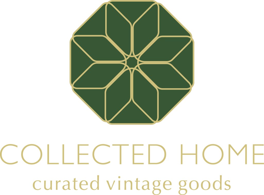
Take a look at this logo that I designed for Collected Home. The small business sold refurbished home decor and an eclectic collection of vintage finds. I took a simplified outline of a house and repeated it radially 8 times to create a floral emblem. This solution was a sophisticated reflection of the business name (being a collection of 8 homes) and embodied the organic nature in which the furniture items were refurbished and transformed into original pieces.

Limit Your Colors
Following along with the idea of keeping it simple, your logo should only contain 1-3 colors (plus black and white if needed). Colors will also speak to the mood and culture of your brand, so it’s important to think about what type of experience you’re trying to create for your customer when they encounter your brand. Bright yellow is associated with fun and joy. Black, browns and monotones give a classy feel. Blue is a very calming color, while green can represent earth and nature. In the logo above, green and gold were chosen as the primary colors to reiterate vintage decor, natural materials, and sophistication in design.
It is also important to have a black only and white only version of your logo for watermarks and gray scale printing.
Pick a Readable Font
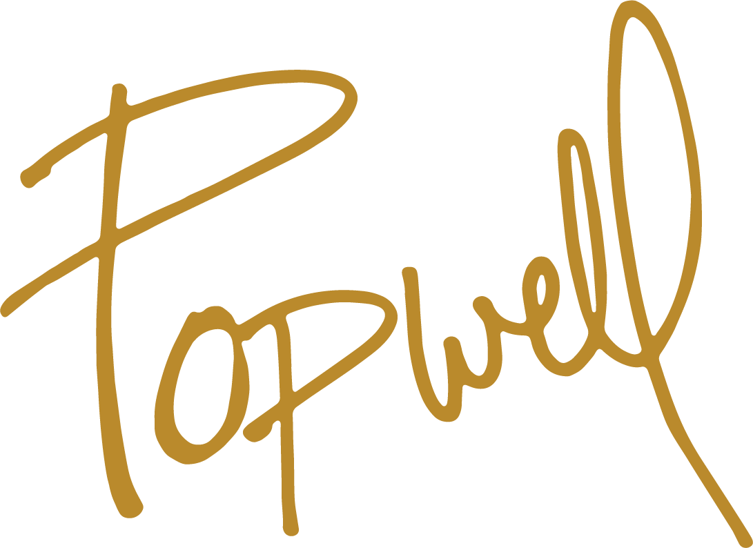
Just like colors, fonts will also add to the style of your brand. Handwritten fonts are more feminine. San serif fonts (like arial) are modern and clean, while serif fonts (like times new romans) are traditional and elegant. Regardless of the font that you choose to represent your brand, it is important to make sure that it is readable. Handwritten and script fonts can be difficult to read at a long distance. These fonts are beautiful and have their place, but knowing that the most important purpose of your logo is to make a memorable impression on your audience quickly, choosing a confusing font should not be a part of your logo design.
Once you have decided on your logo design, test its visibility at various distances. Ask anybody and everybody to view it from across the room, across the street and in small print like on a business card. A strong logo should be recognizable close up and far away from consumers in moving vehicles. You should always have a vector file of your logo. Vector files are scalable files that can be printed at any size without the loss of quality.
Your logo is the face of your brand. Many do-it-yourself programs, (especially in free subscriptions) or AI prompting programs will only create raster images. While you can create beautiful logos with these programs, you will be limited with how you can use your files and may have to pay someone eventually to create the vector equivalent. Convenience always comes with a cost. Making smart decisions on the front end and choosing to work with a quality, seasoned designer will create a beautiful partnership in your journey towards success, saving you trouble in the end. Let’s connect and discuss your logo idea.
(Original content, without ai assistance. Initially written as teaching material for students and republished for AlphaGraphics Hoover in July 2023.)
